Becoming visible is a process that goes far beyond the question of the right color or shape. Becoming visible is about focusing and committing, putting ideas into words, defining values, allowing yourself to have visions. This can be challenging, especially when the result is to be the basis for professional success. I accompany such processes with empathy and tact, support in gaining clarity and being proud of what is. Katrin Neiss, Neiss CoachingContribution: Positioning, (re)branding, design Kornelia Wulf, Souls OfficeContribution: Branding, design Anne Lücking Mewald, Art therapy & painting classesContribution: Positioning, photography, design Christiane Kiegeland, beziehungsweisenContribution: Positioning, branding explore.define.grow, personal development for womenContribution: Positioning, course design, design, photography Year: 2019 – 2020, Berlin
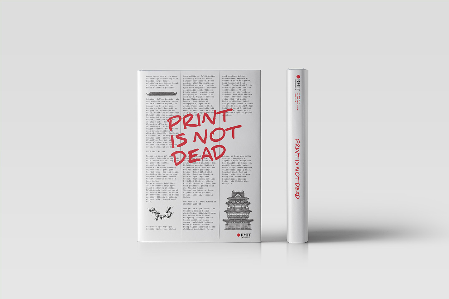
Print is not dead
After conducting my publication design course twice at RMIT Vietnam, I decided to initiate a publication on book design, more specifically, a presentation of students’ works from 2017 and 2018 to consolidate the idea of: “Print is not dead”. The book – supported by the School of Communication & Design and the Beanland Library, Saigon South Campus – has been published in March 2019. “I used to leave books in my motorbike trunk. But now, since I partly understand how much love writers and designers put into, I hold, open and read them with all my respect. Gaining knowledge in a course is its obvious goal. But changing attitudes towards things around is definitely not something many courses can achieve.”Nguyen Ha Giang, student & book award winner 2018 Project: Publication “Print is not dead”Contribution: Editor, author, concept & creative directionUniversity: School of Communication & Design, RMIT VietnamYear: 2019 (ISBN: 978-1-922016-48-5)

IGS, Hcmc
The International German School Ho Chi Minh City (IGS) is an inter-cultural place of learning and is open to children of all nationalities – this is the new positioning with which the IGS now presents itself on the market. Project: positioning, branding, website, eventsContribution: Concept, design, creative directionClient: International German School, Ho Chi Minh City, VietnamYear: 2015
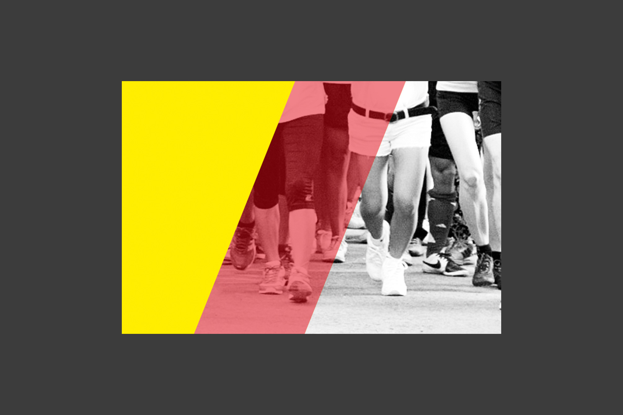
Vietnamese German Charity Run
Running for a good cause! The German Consulate General in Ho Chi Minh City annually organises a „Vietnamese German Charity Run“ to raise money for a pre-defined project. This year the event got a professional branding, logo and other means of communication – Recognition in 2016 guaranteed! Project: Branding for a charity eventContribution: Concept, designClient: German Consulate General, Ho Chi Minh City, VietnamYear: 2015
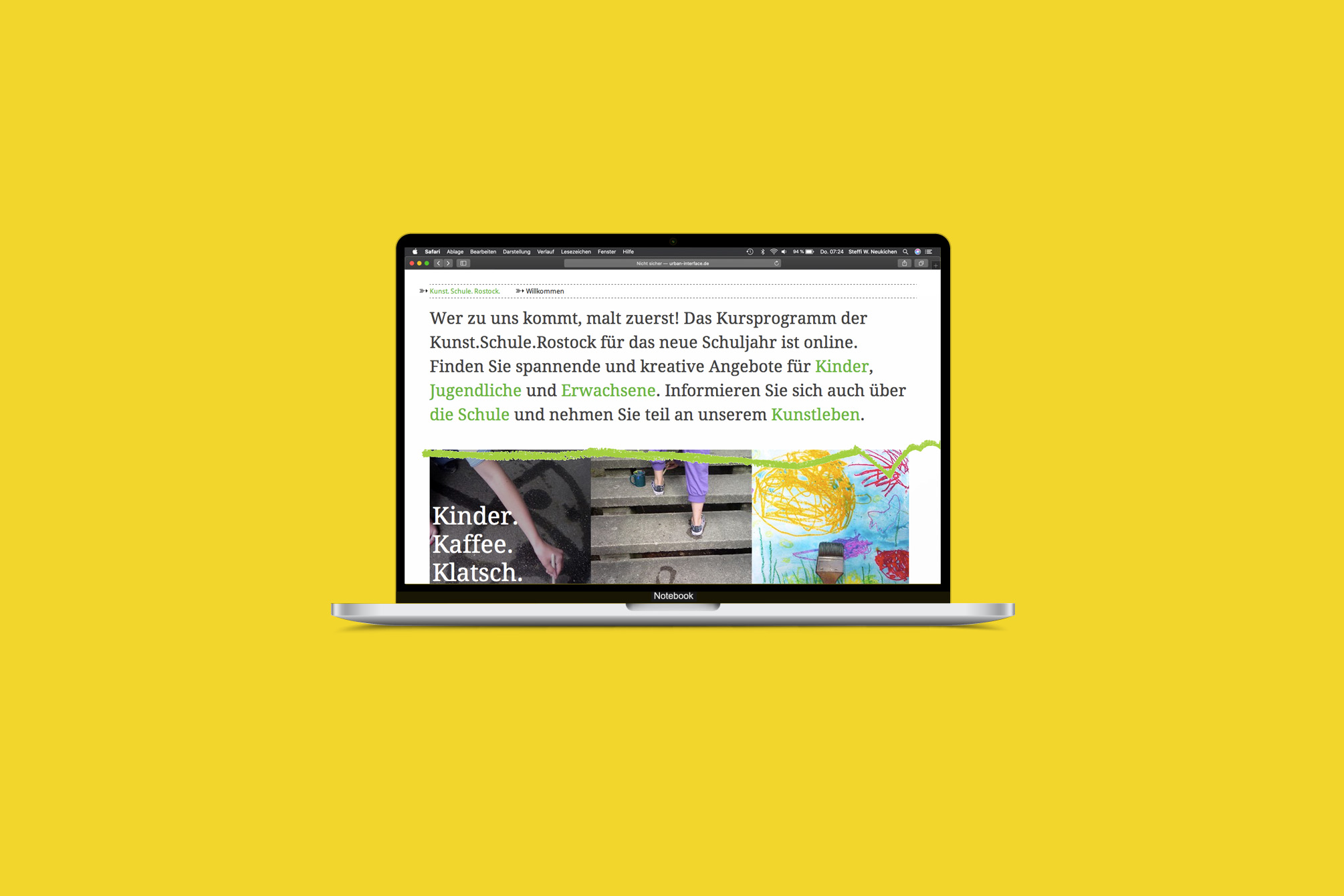
Kunst.Schule.Rostock.
„Wer zu uns kommt, malt zuerst!“ – The Kunst.Schule.Rostock addresses people of all ages and has set itself the task of promoting creativity, imagination and artistic expression. I was able to accompany the school during its reorganization, during the move to interim quarters while the old school building “Frieda 23” was being renovated, and also during the second move back. With each step, the communication became clearer and the processes, e.g. for course booking with the help of an online registration tool, became easier and more professional. Project: Strategic consulting, new branding and websiteContent management system and registration toolVarious means of communicationThe website was developed in collaboration with Tim Kellner, Rostock. Contribution: Concept, design, creative directionClient: Kunst.Schule.Rostock, RostockYear: 2011 – 2013
The Young ClassX
„Nur gute Noten!“ – The Young ClassX is a Hamburg-wide music project supporting young children and teenagers, initiated by the Otto Group and the Ensemble Salut Salon. Anyone can participate. The only prerequisites: Curiosity and joy of music. Project: The Young ClassX website and community for the young participantsContribution: Concept, design, creative directionAgency: Fork Unstable Media, HamburgYear: 2010
RITTER SPORT Friends
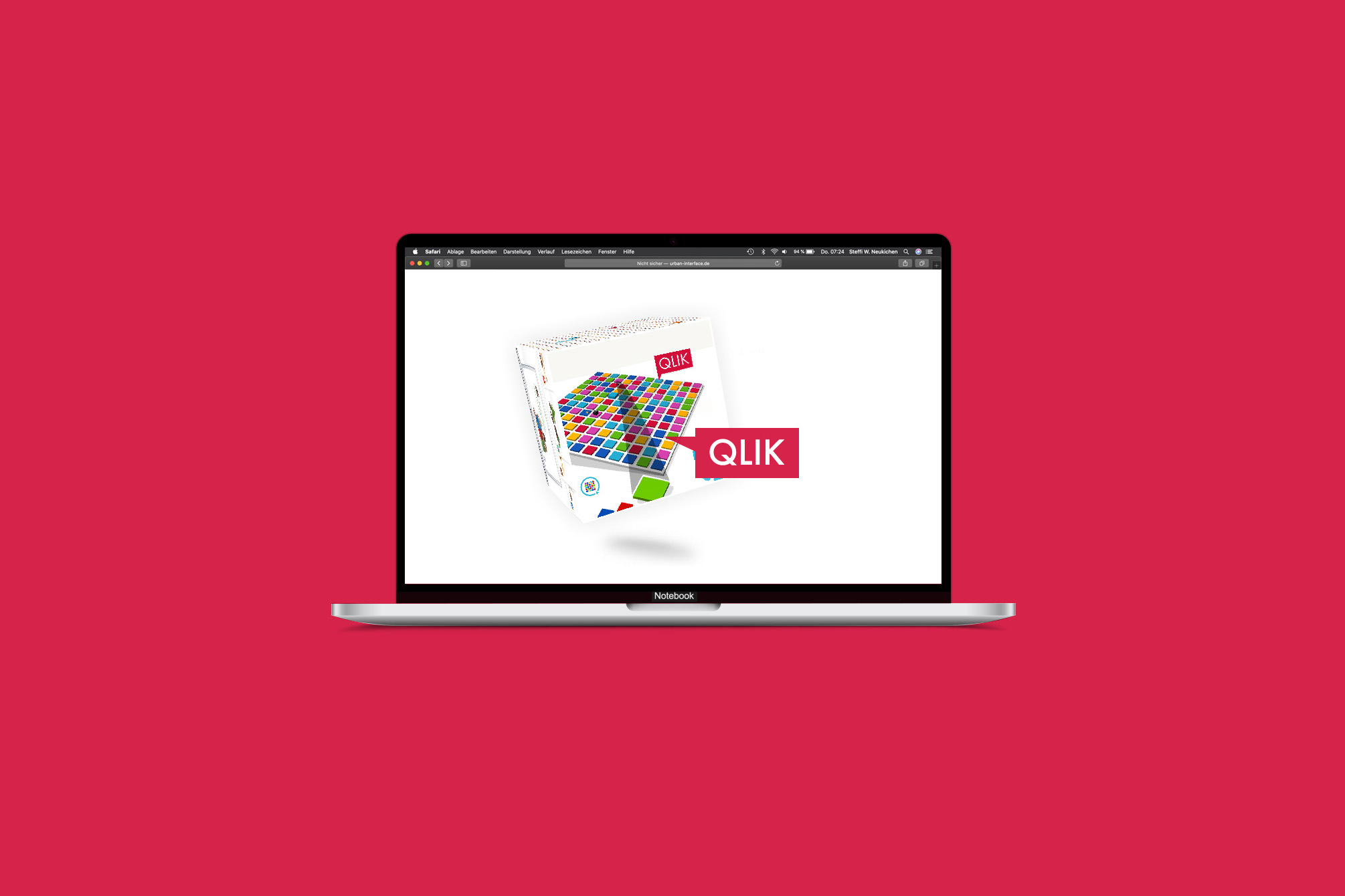
Strawberry Yogurt, Alpine Milk or Full Nut Friend? Everyone can decide. Everyone can be part of it. AwardBronze at Online Star-Award 2009, Ulm Project: Relaunch of the campaign website www.rittersportfreunde.deEntertainment platform containing a realtime multiplayer browser game QLIKRegistration with avatar tool, RITTER SPORT-friends galleryIntegration of the platform into the brand website Contribution: Concept, design, creative directionAgency: Fork Unstable Media, HamburgYear: 2009
5 6 7 8
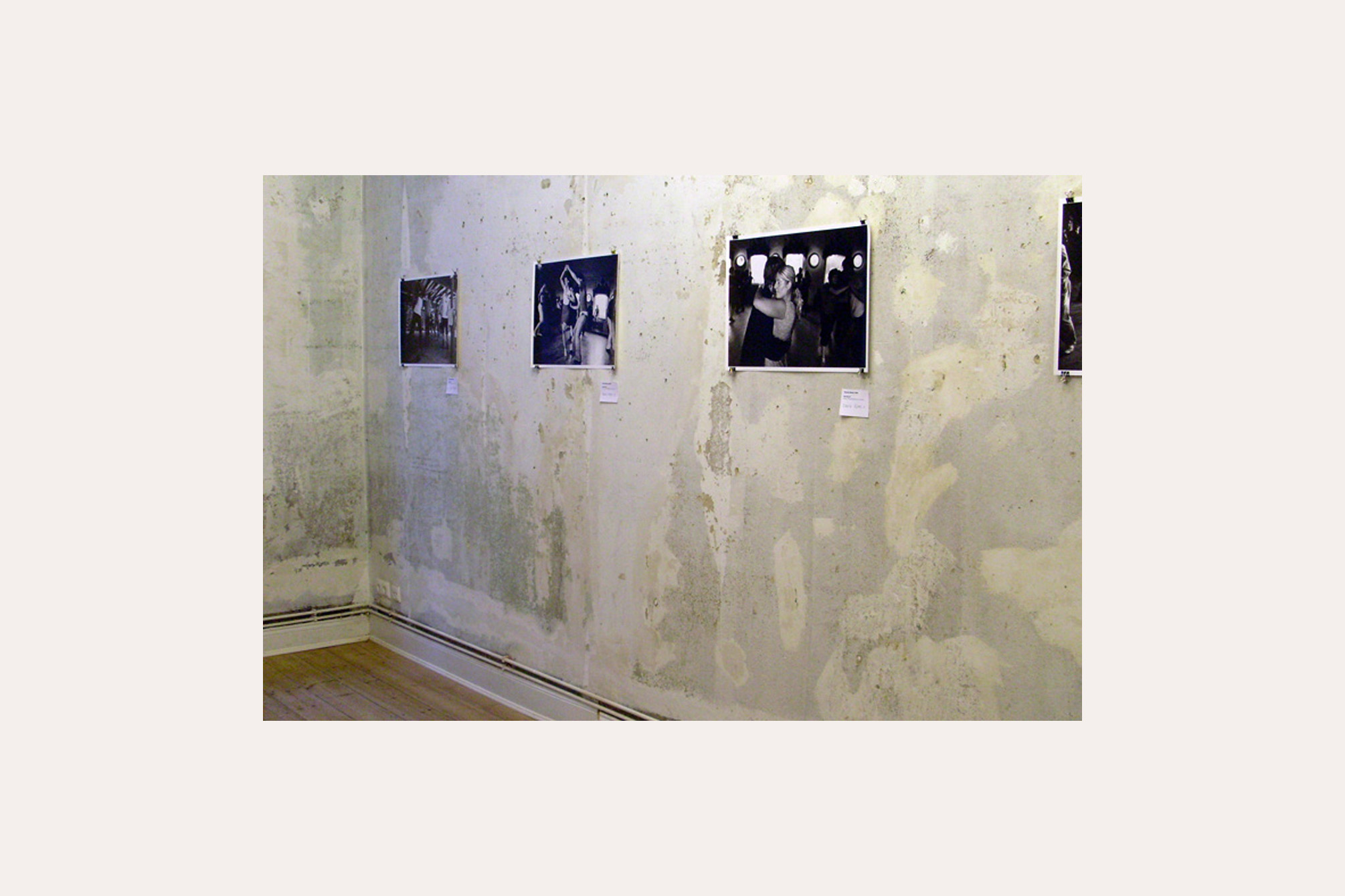
triple Step, triple Step, … in case you once visited the international „Herräng-Dance-Camp“ in Sweden and have been dancing there: Lindy Hop, Balboa, Charleston, you know, that you get easily lost in the music and the lifestyle of the 1930s. We wanted to transfer this very special feeling to Hamburg with a one-week exhibition event. Project:5 6 7 8 – Approaches to the phenomenon of „Herräng“ with photographs by Thomas Marek Concept and implementation of a one-week exhibition eventVernissage with swing party and finissage with live jamIn collaboration with Berit Stelzer, Cord Marquardt and Stefan Semrau Object: Seven Golden Rules of Lindy HopPlywood, paint, 8 x 70 x 100 cm Installation: MomentsVideo and 259 snap shots Place: Kunst- und Kulturverein LINDA, HamburgYear: 2008
RITTER SPORT Bio
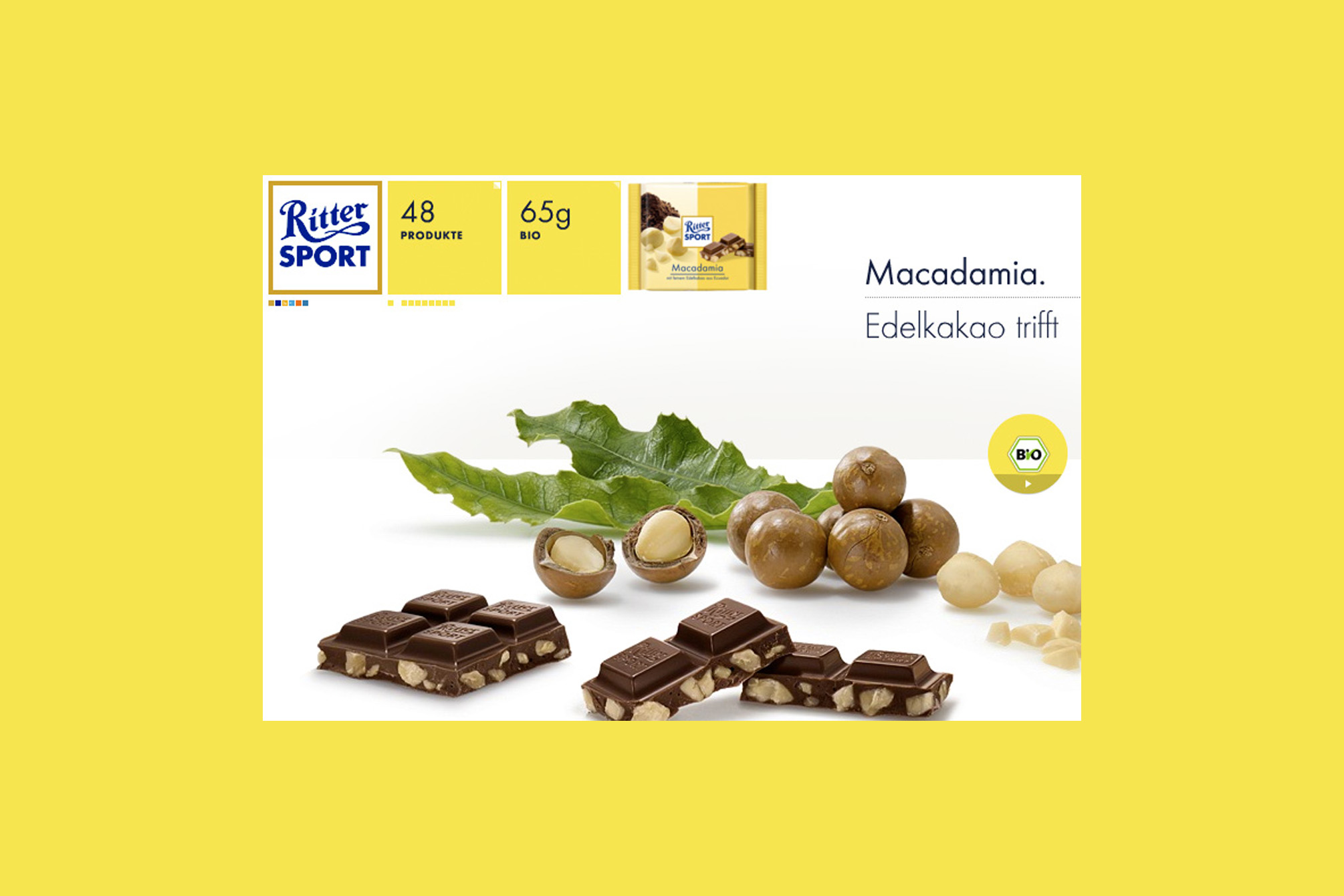
„Mir sind Schwabe, mir könne ned anderscht,“ – this is the Swabian way of saying „We can not help it“ and it was Alfred Ritter’s answer to the question why the RITTER SPORT Organic Chocolate is made with such great effort, perfection and attention to detail. There is nothing to add. Project: Web special for the introduction of the RITTER SPORT organic chocolate rangeContribution: Concept, design, creative directionAgency: Fork Unstable Media, HamburgYear: 2008
RITTER SPORT
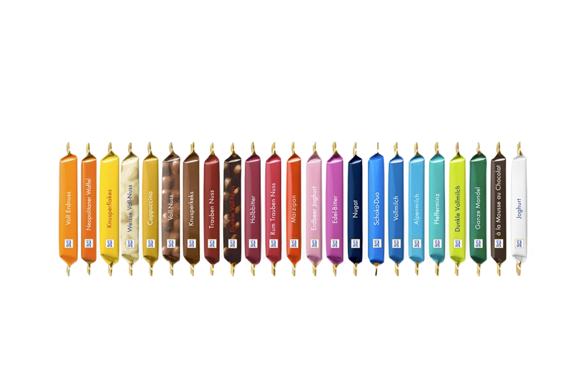
Why is the RITTER SPORT chocolate a square? Because it fits better in the pocket of a sports jacket without breaking and still has the same weight as a conventional bar. This was Clara Ritter’s pioneering idea in 1932, profitable also because the new factory in Waldenbuch was located on the way to the sports field. With the relaunch of the German brand website, a new online strategy was developed to build up a comprehensive offer of information and a cohesive brand experience in several steps. The „RITTER SPORT Spirit“ (to experience the brand and the products in a playful way), honesty (Swabian Authenticity) and quality were identified as the major brand values. The new website is an homage to the square shaped chocolate, the colours of the products can be found in the navigation and teasers. For the relaunch, we developed a new kind of product staging: large tasty chocolate pieces in combination with the corresponding „best“ ingredients. The pictures we shot for the website are now widely used. Based on the German brand website, three language versions (English, Italian, Russian) were developed. AwardsNominated for the Design Award of the Federal Republic of Germany 2009, Berlinred dot for high design quality, red dot communication design award 2008, EssenSilver medal at the DDC competition Kommunikation vernetzt 2008, Frankfurt am Main German brand website Internationalisation Project: Relaunch of the German brand websiteDevelopment of an online strategy and (online) corporate designProduct staging, ShootingContribution: Concept, design, creative directionYear: 2008 Agency: Fork Unstable Media, Hamburg