Becoming visible is a process that goes far beyond the question of the right color or shape. Becoming visible is about focusing and committing, putting ideas into words, defining values, allowing yourself to have visions. This can be challenging, especially when the result is to be the basis for professional success. I accompany such processes with empathy and tact, support in gaining clarity and being proud of what is. Katrin Neiss, Neiss CoachingContribution: Positioning, (re)branding, design Kornelia Wulf, Souls OfficeContribution: Branding, design Anne Lücking Mewald, Art therapy & painting classesContribution: Positioning, photography, design Christiane Kiegeland, beziehungsweisenContribution: Positioning, branding explore.define.grow, personal development for womenContribution: Positioning, course design, design, photography Year: 2019 – 2020, Berlin
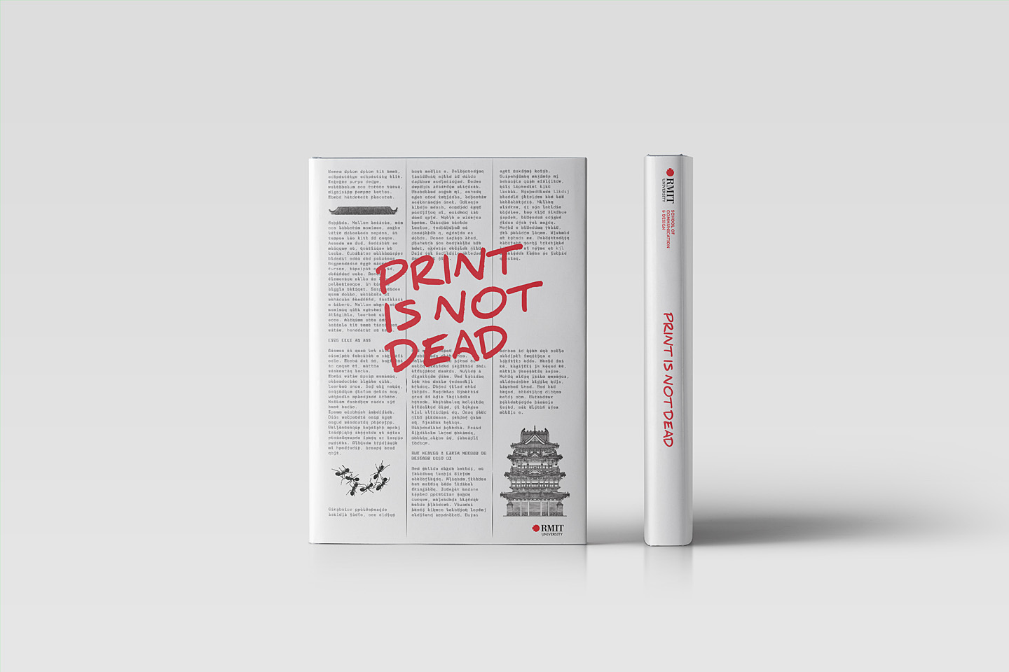
Print is not dead
After conducting my publication design course twice at RMIT Vietnam, I decided to initiate a publication on book design, more specifically, a presentation of students’ works from 2017 and 2018 to consolidate the idea of: “Print is not dead”. The book – supported by the School of Communication & Design and the Beanland Library, Saigon South Campus – has been published in March 2019. “I used to leave books in my motorbike trunk. But now, since I partly understand how much love writers and designers put into, I hold, open and read them with all my respect. Gaining knowledge in a course is its obvious goal. But changing attitudes towards things around is definitely not something many courses can achieve.”Nguyen Ha Giang, student & book award winner 2018 Project: Publication “Print is not dead”Contribution: Editor, author, concept & creative directionUniversity: School of Communication & Design, RMIT VietnamYear: 2019 (ISBN: 978-1-922016-48-5)
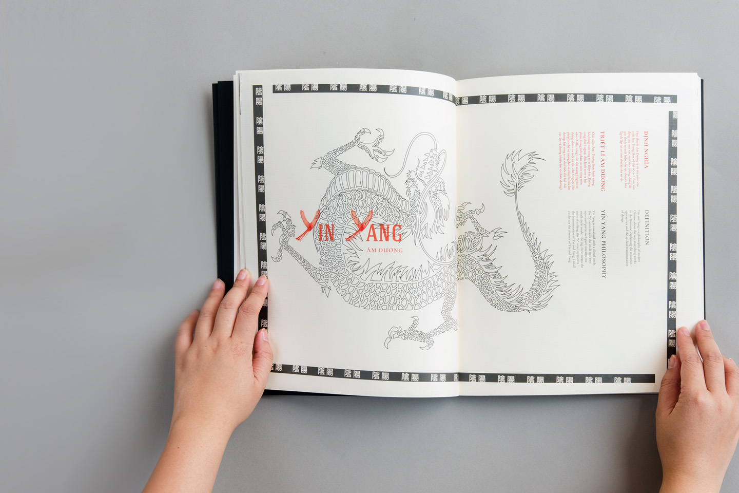
Teaching: Publication Design
Print is not dead – in this project, students had the opportunity to explore the book as a medium that offers multiple design possibilities, satisfying human needs while nourishing several of our senses. A medium that can provide an unparalleled immersive experience. In addition, students were tasked with developing a concept for how a publication could be enriched or enhanced using digital technology, such as augmented reality. The students took the opportunity to explore the medium and – by freely choosing their topic – themselves: their origins and cultural backgrounds, ideas they hold dear, messages and experiences they want to share. Storytelling was an important part of the curriculum and some had their first experience as an author, illustrator or both in this project. A pile of books presented after the first course in January 2017 How to „go green“, live a more sustainable live, why not getting inspirations from ants? Giang Nguyen Ha gave a lot of recommendations and showed for example how to make your own paper from trash (January 2018). Using her grandfather’s poems, Le Hoang Huong Nhi shows how to live a life to fullest, even in your late years: „Loving the salt & pepper life“. „The method of Heaven & Earth to restore lost Qi“ is an inspiration for young people to mind traditional medicine. More images of Ta Quang Huy‘s book can be found on his Behance profile Thinking about enhancing a printed matter with digital technology, Tran Nu Hoang Kim developed an Augmented Reality App showcasing mythical creatures of Native American culture for her book: „The realms of spirit“. „Superstrings to the rescue“ is a scientific art book about string theory, a contemporary idea in theoretical physics. The book becomes Nguyen Ngoc Tuong Minh‘s personal aesthetic translation of the string theory language. About the courseStudents learned not only in the classroom, but also through various activities, field trips, exhibition visits, or in the library. I worked with Clare O’Dwyer, the director of the Beanland Library on campus, to develop a Book Award that could be won each semester, paired with an exhibit in the library. In addition, the books of the award winners were added to the library’s collection. I invited Long Dang, the founder of the Saigon Art Book project, and Giang Nguyen Hung, the designer of the latest book, to talk about contemporary Vietnamese book design. We took field trips to an offset printing company and to the Type Directors Club exhibition organised by the German Goethe-Institut in Ho Chi Minh City. Visiting an offset printing house Type Directors Club exhibition, organised by the Goethe Institute More examples of student work: Course: ProjectContribution: Idea, course design, teachingProgram: Bachelor of Design (Digital Media) University: School of Communication & Design, RMIT VietnamYear: 2016 – 2018
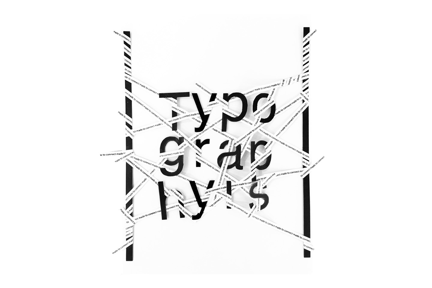
Teaching: Typography
How do basic letterforms differ? What relationships arise, depending on their position in two-dimensional space? How can we promote and prevent legibility? How do “construction and deconstruction” affect basic letterforms? – These were simple research questions the students, began to work on in my typography class at RMIT Vietnam. By hand and on paper. Within the second step, they used the results in their digital work to convey a strong message in a poster series. The topics were free to choose: human rights, social issues, health, environmental protection, … Nguyen Chanh Minh’s interactive poster series is visualising recommendations of the “Ministry of Social Wellbeing”, but not without questioning them by adding a second layer that can be revealed on pressing a button. Nguyen Thai Ha reminds us that we are responsible for saving endangered animals. Le Hoang Minh Nhat introduces three attractions from his hometown in the Mekong Delta, using what he has identified as „Vietnamese Style“. Tran Hanh Vy about confidence Nguyen Ngoc Tra My about drug addiction Hand made typography labThe students worked with basic letterforms printed on paper, to explore their shape, relationships and experiment. The exercises built upon each other and each student submitted a second set of posters made by hand. Exemplary results from different students. Course: TypographyContribution: Course design, teachingProgram: Bachelor of Design (Digital Media)University: School of Communication & Design, RMIT VietnamYear: 2017

IGS, Hcmc
The International German School Ho Chi Minh City (IGS) is an inter-cultural place of learning and is open to children of all nationalities – this is the new positioning with which the IGS now presents itself on the market. Project: positioning, branding, website, eventsContribution: Concept, design, creative directionClient: International German School, Ho Chi Minh City, VietnamYear: 2015
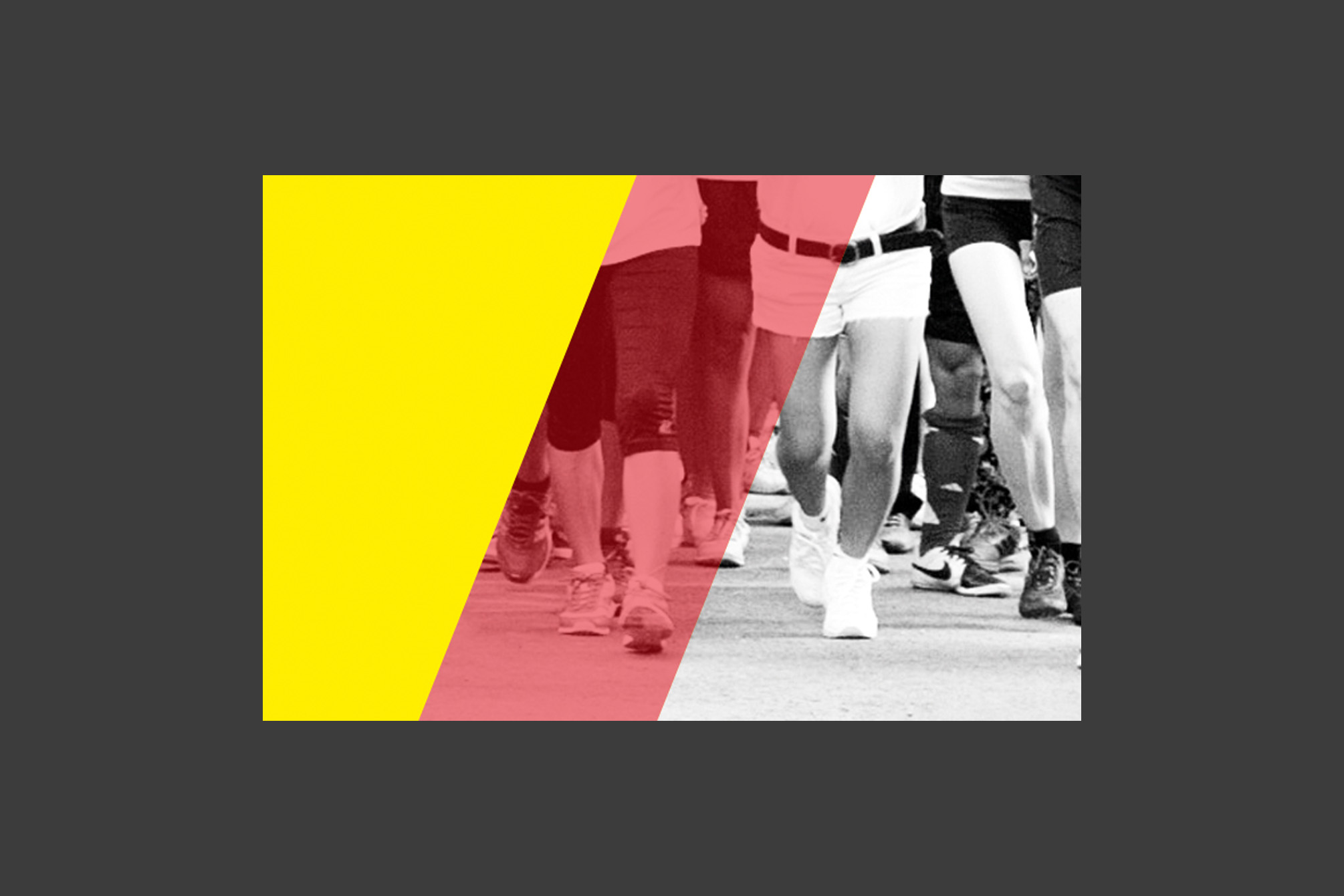
Vietnamese German Charity Run
Running for a good cause! The German Consulate General in Ho Chi Minh City annually organises a „Vietnamese German Charity Run“ to raise money for a pre-defined project. This year the event got a professional branding, logo and other means of communication – Recognition in 2016 guaranteed! Project: Branding for a charity eventContribution: Concept, designClient: German Consulate General, Ho Chi Minh City, VietnamYear: 2015
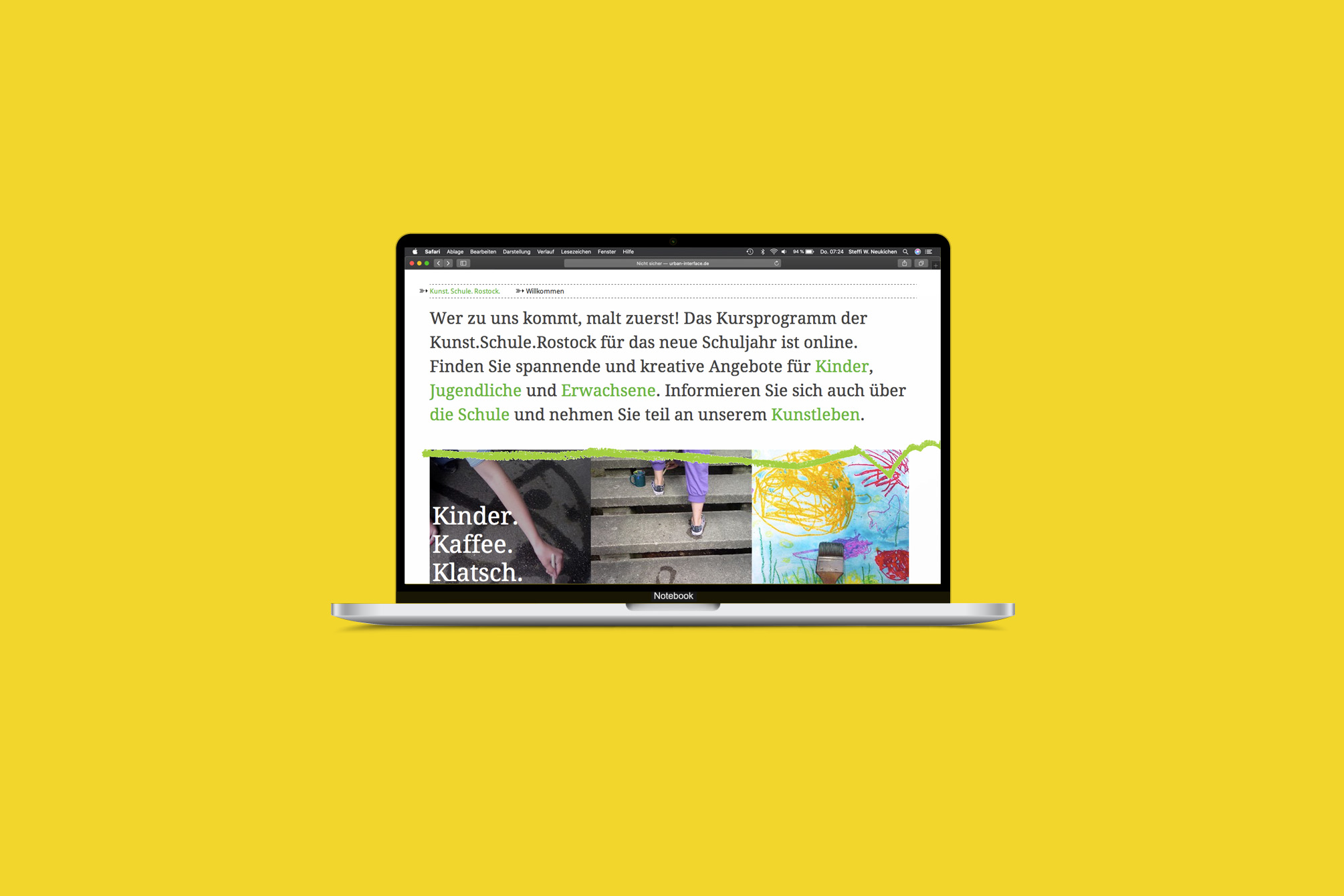
Kunst.Schule.Rostock.
„Wer zu uns kommt, malt zuerst!“ – The Kunst.Schule.Rostock addresses people of all ages and has set itself the task of promoting creativity, imagination and artistic expression. I was able to accompany the school during its reorganization, during the move to interim quarters while the old school building “Frieda 23” was being renovated, and also during the second move back. With each step, the communication became clearer and the processes, e.g. for course booking with the help of an online registration tool, became easier and more professional. Project: Strategic consulting, new branding and websiteContent management system and registration toolVarious means of communicationThe website was developed in collaboration with Tim Kellner, Rostock. Contribution: Concept, design, creative directionClient: Kunst.Schule.Rostock, RostockYear: 2011 – 2013
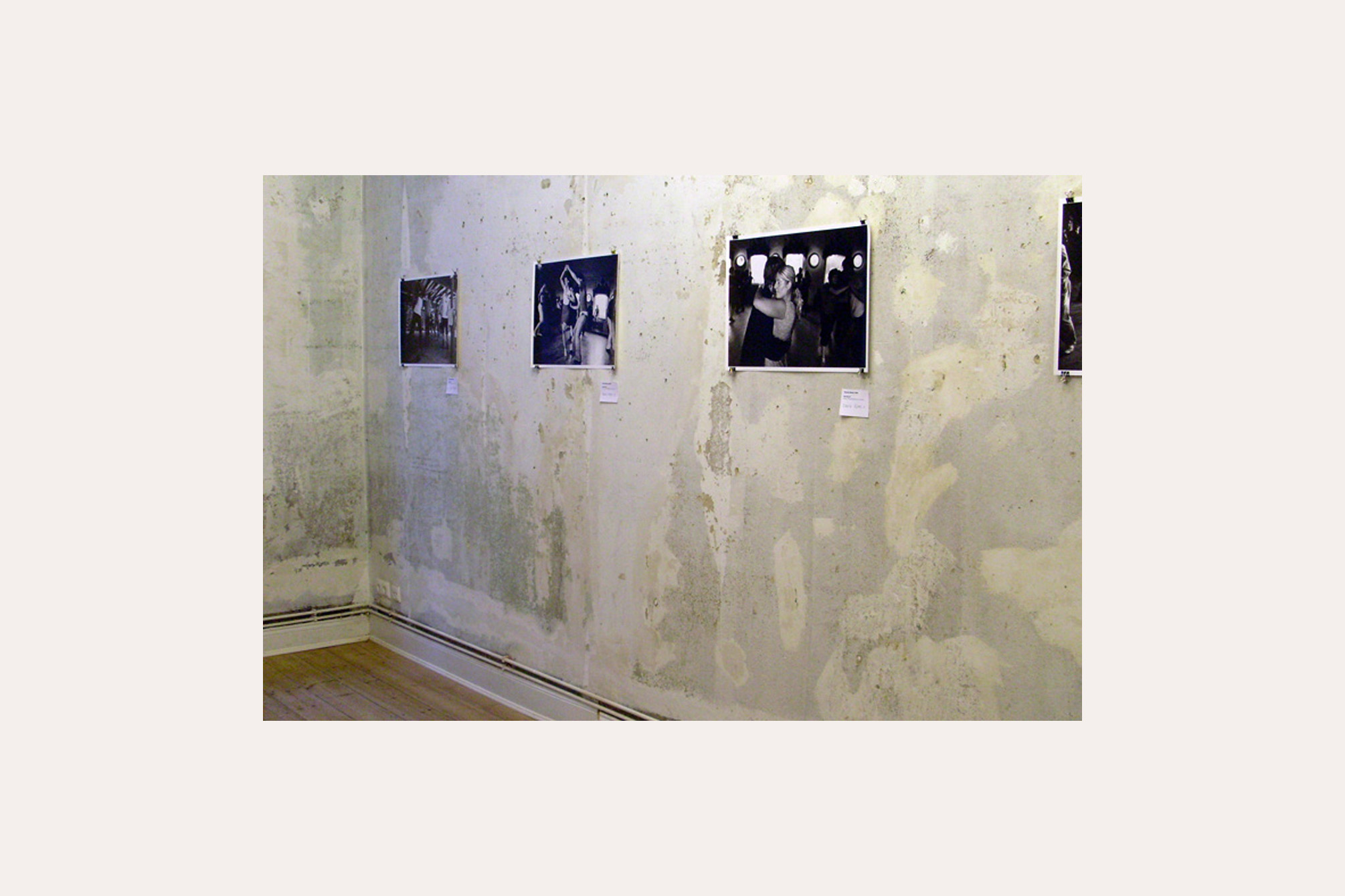
5 6 7 8
triple Step, triple Step, … in case you once visited the international „Herräng-Dance-Camp“ in Sweden and have been dancing there: Lindy Hop, Balboa, Charleston, you know, that you get easily lost in the music and the lifestyle of the 1930s. We wanted to transfer this very special feeling to Hamburg with a one-week exhibition event. Project:5 6 7 8 – Approaches to the phenomenon of „Herräng“ with photographs by Thomas Marek Concept and implementation of a one-week exhibition eventVernissage with swing party and finissage with live jamIn collaboration with Berit Stelzer, Cord Marquardt and Stefan Semrau Object: Seven Golden Rules of Lindy HopPlywood, paint, 8 x 70 x 100 cm Installation: MomentsVideo and 259 snap shots Place: Kunst- und Kulturverein LINDA, HamburgYear: 2008
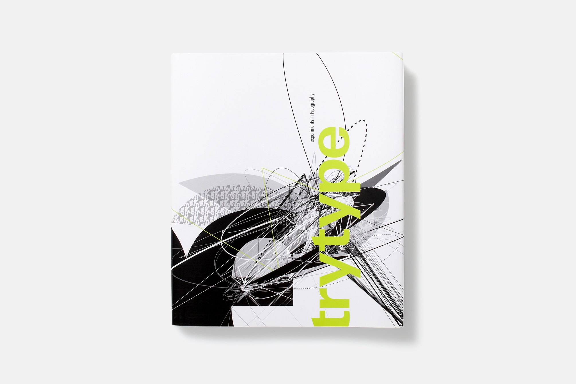
trytype – experiments in typography
Imitation strongly encouraged! The results of the students’ “Experimental Typography” seminar were presented in a book – designed by the students themselves and published by Linotype Library, Bad Homburg. After a theoretical introduction to the historical development and significance of experimental typography, the theme of the seminar and the making of of the works were presented. Each piece is accompanied by playful instructions and documentation of the typeface used to inspire the community of readers to imitate, experiment with, and integrate experimental typography into their daily work. AwardsSilver medal at the Printers Club Award by M-Real, 2005, HamburgSilber medal at the CCD competition „Kommunikation vernetzt“ 2005, Frankfurt am Main Project: “trytype – experiments in typography”Mergenthaler Edition Linotype Library, Bad HomburgISBN 3-9810-319-1-1 Authors: Professor Guido Ludes, Steffi W. NeukirchenContribution: Concept, design, creative directionUniversity: RheinMain University of Applied Sciences, WiesbadenCooperation partner: Linotype Library, Bad Homburg, GermanyYear: 2005