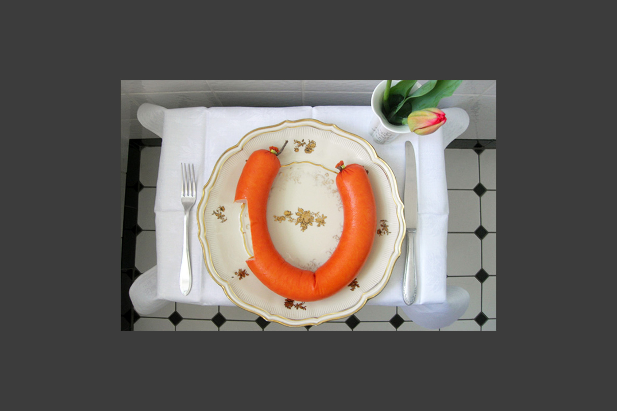
… was an interactive art and event series with regular „happenings“. They usually took place in a kitchen in Hamburg and the visitors were part of the concept. They either brought the art with them or created it on site. This concept opened a creative playground for adults. Projekt: Interactive art eventTask: Idea, concept and execution In collaboration with Maren Kunzendorf and Cord MarquardtYear: 2006 – 2011
Aspirin
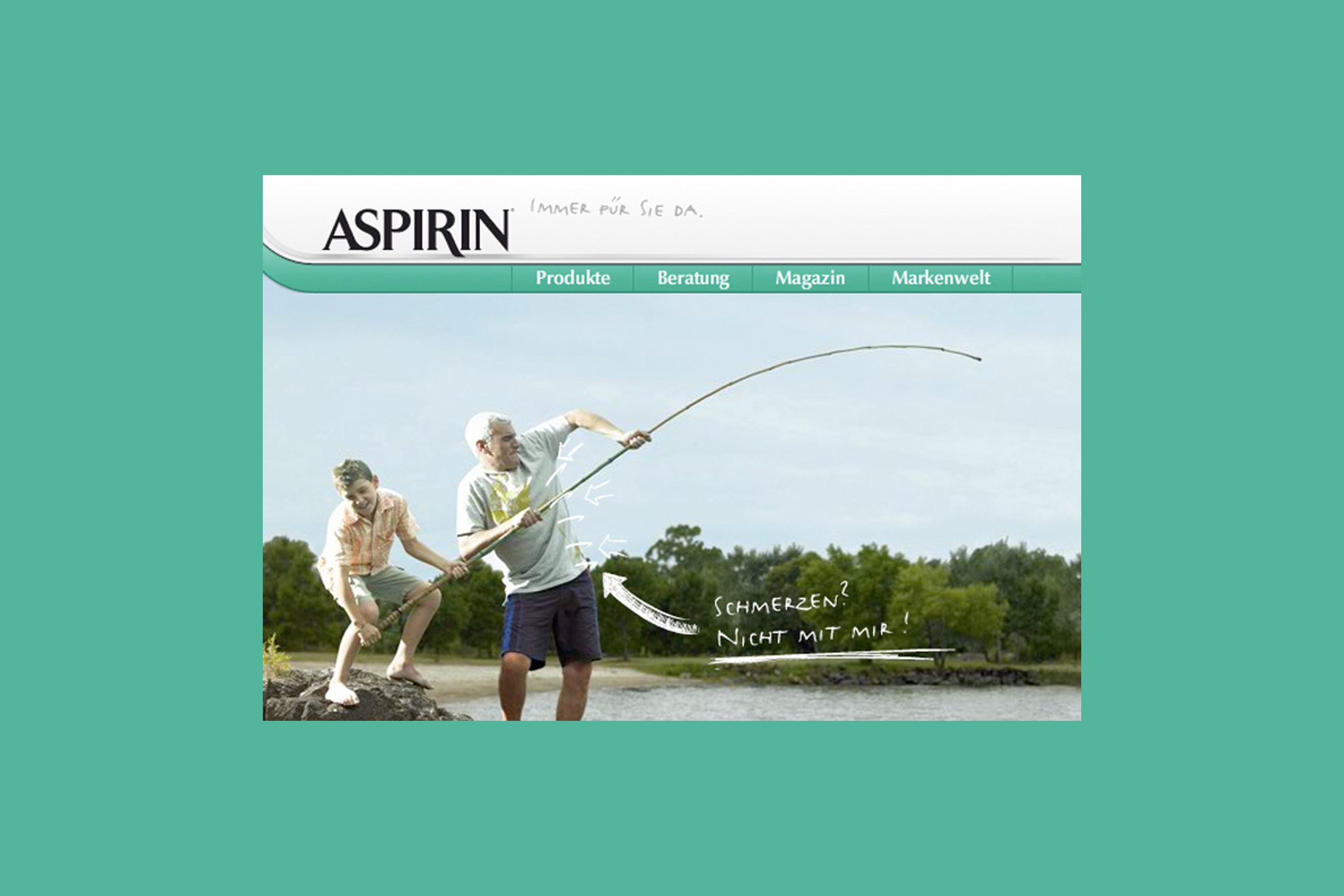
Pain? No way! There is a solution for every kind of pain, as well as for outdated design: after the Aspirin product packaging has been renewed, the website was adapted and modernised. Accompanying the packaging relaunch of the aspirin products, the German brand website was revised in its structure and adapted to the new look. A new image and illustration style has also been developed for the website. The result is user friendly and easy to navigate, each product section has its own style. Additionally, a pain counselling tool was created and the brand history mapped. Project: Relaunch of the German brand website of Aspirin (Bayer Health Care)Contribution: Concept, design, creative directionAgency: Fork Unstable Media, HamburgYear: 2008
Urban Interface | Berlin
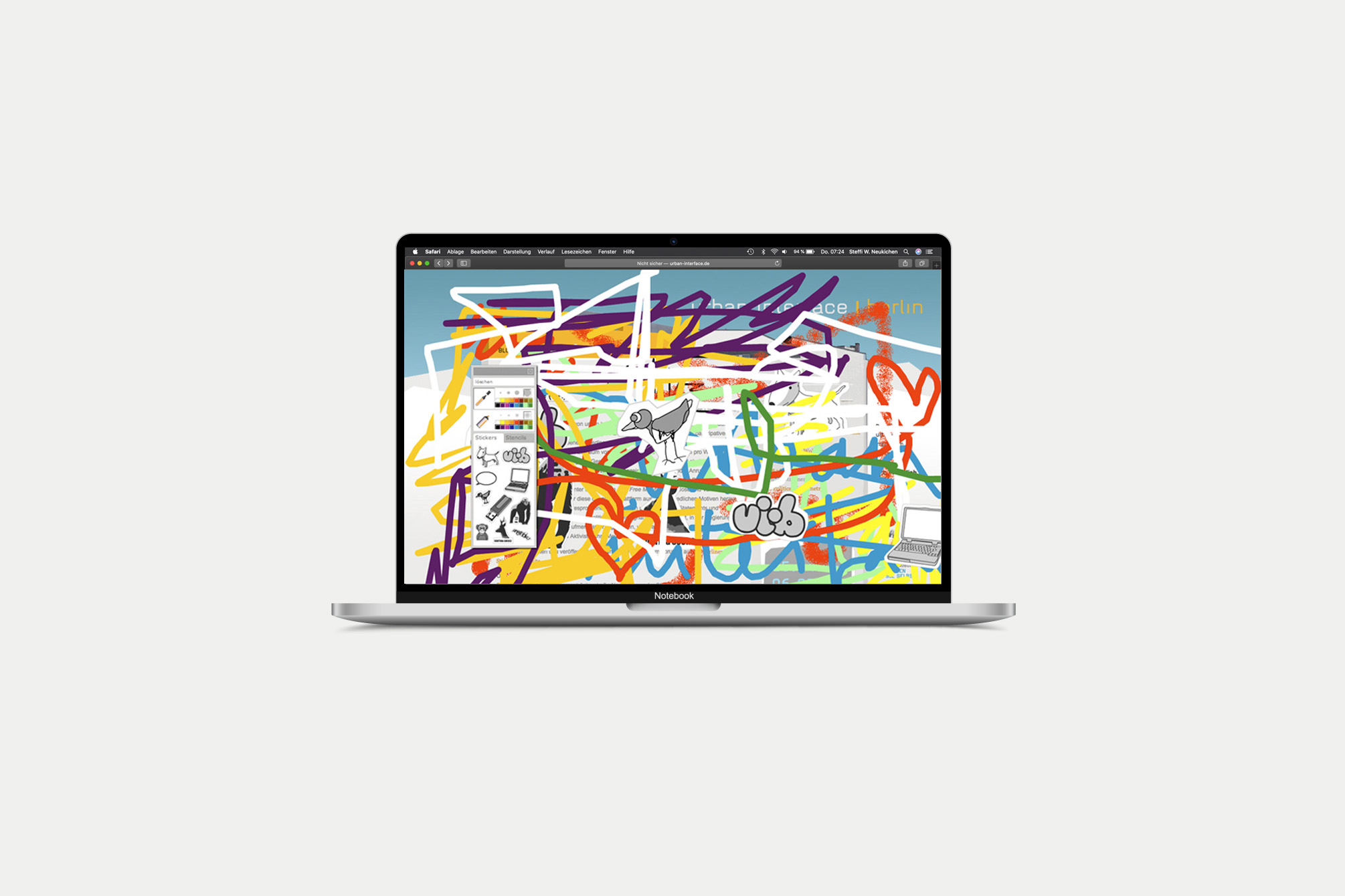
„Urban Interface“ is an art project that deals with the „changing understanding of the public and private space“. After a first run in Berlin, it also took place in Oslo. The website introduces the artists and their projects. It also documents all processes and over time it becomes an information and communication platform for the project participants (organizers, artists, hosts). A blog was set up which could easily be duplicated for further events in other cities (for example the Oslo Arts Festival). Within the graffiti tool, users could create and experiment with their own urban interface. They had various colour, digital markers, spray cans and stickers available. Project: Website for presenting and monitoring the project, graffiti toolContribution: concept, design, art directionAgency: Fork Unstable Media, HamburgYear: 2007
8 x 4
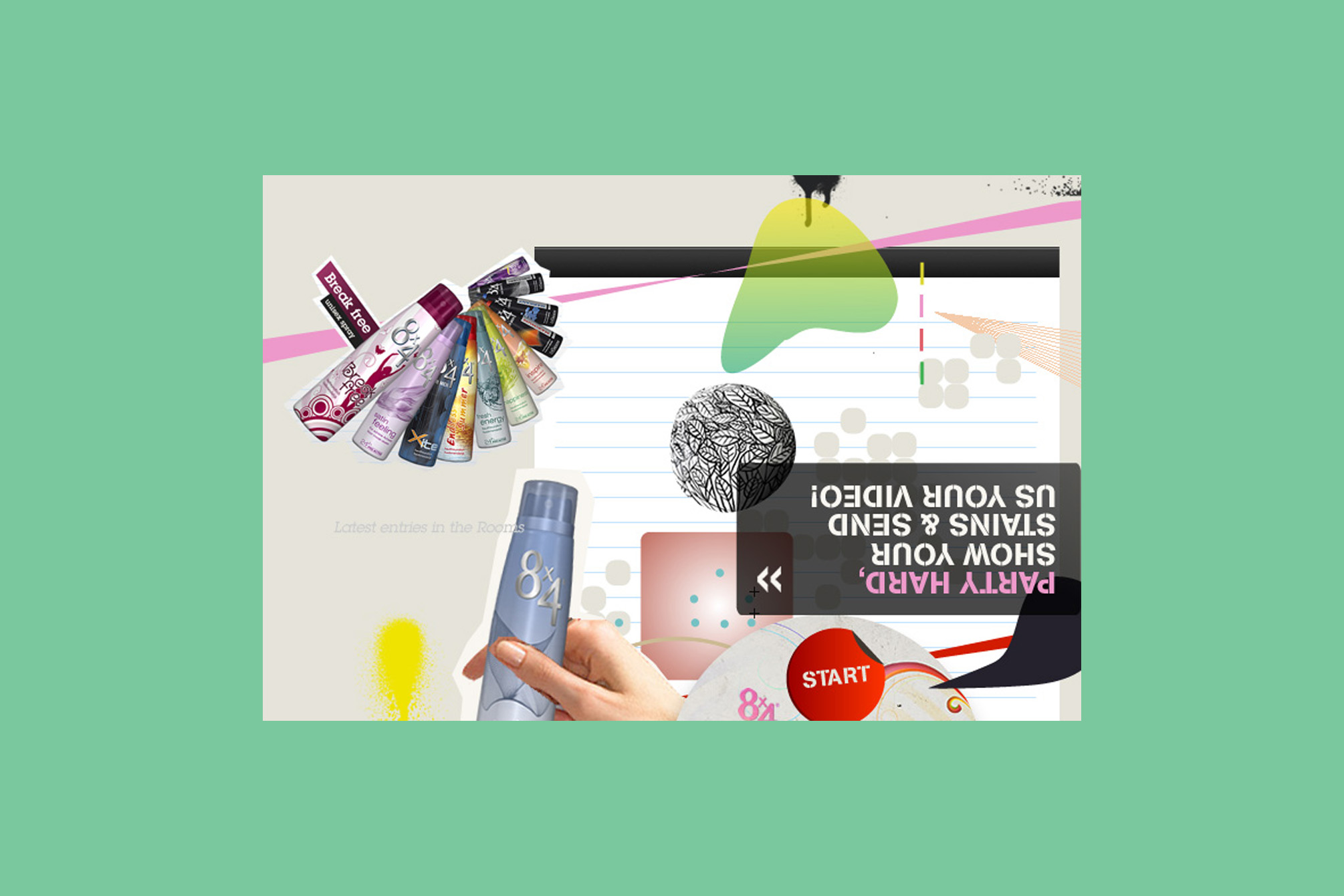
Sweat Yourself – People sweat when they have fun! We wanted young people to document this fun, to allow them to have a more relaxed relationship with their bodies. New packaging, new claim „Live your Style“, new website. Our task was to find a new strategy to talk to the target group of young people from the age of 16, the generation „always on“. Diverse hands-on opportunities and the idea of the users designing something themselves were the focus of the new concept. Changing backgrounds made the site just as lively as the photo campaign with the motto „Sweat Yourself“. Furthermore, each product was provided with an individual animation, inspired by the packaging and a merchandising product line – shirts with colourful „stains“ – was developed. Unfortunately we did not win the pitch, but I still think that the idea was brilliant! We were early movers of the #bodypositivity movement – but the brand was not ready for that yet. Project: Pitch for the relaunch of the German brand website of 8 x 4 (Beiersdorf)Contribution: concept, design concept, creative directionAgency: Fork Unstable Media, Hamburg in collaboration with Marja Annecke, BerlinYear: 2007
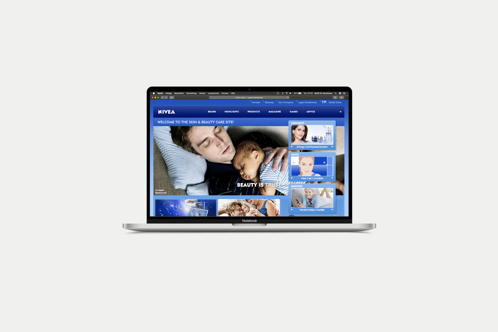
NIVEA 6.0
The new, international NIVEA website was supposed to be more „cosmetic“ and emotional. At the same time, the new umbrella brand strategy „Beauty is …“ was developed, which was integrated alongside a comprehensive history area. The result was a design with many curves and smooth transitions, providing space for large beauty visuals. „Beauty is…“ got its own chapter, in which NIVEA users around the world were invited to describe their own concept of beauty and to document it with a photo. In „The NIVEA History“ chapter the user could get information about the history of the brand and, for example, watch old commercials. The user had the opportunity to browse freely or to choose a „Guided Tour“ to experience the development of packaging in chronological order, for example. Project: Relaunch of the international brand website NIVEA.com (Beiersdorf)Documentation of the new design specifications in an online style guideDevelopment of the new brand presentation Contribution: Concept, design, creative directionAgency: Fork Unstable Media, HamburgYear: 2007
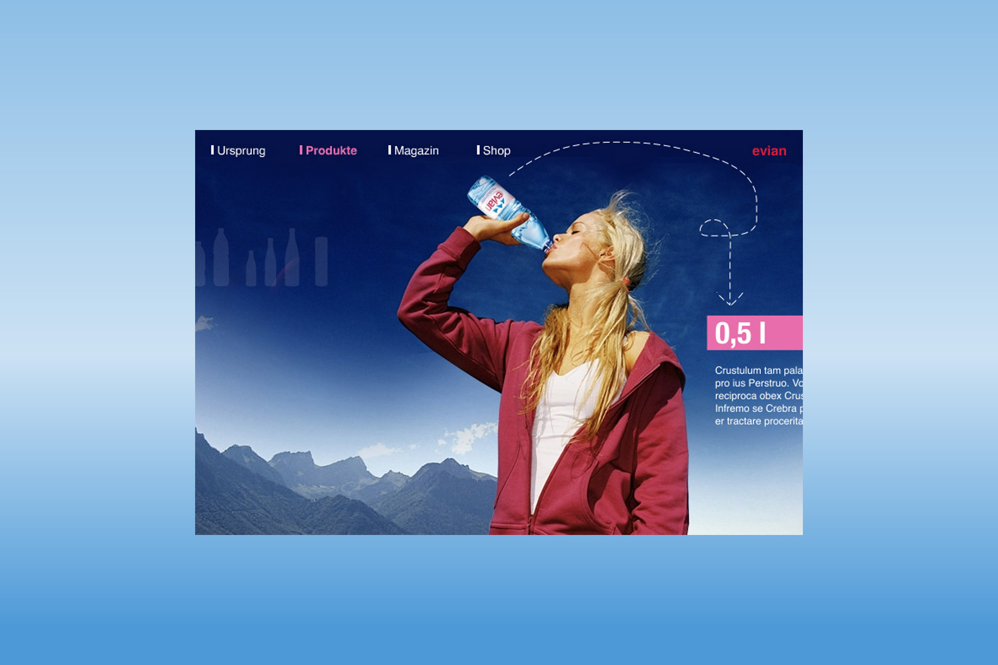
evian
„evian – I am what I drink“ was a very nice pitch project: The brand was supposed to get a new and modern look. The focus was on the origin and purity of Evian water and a lot of information about the meaning of „drinking water“ in general. Project: Pitch for the relaunch of the German brand website of evian (Danone Waters)Contribution: concept, design, art directionAgency: Fork Unstable Media, HamburgYear: 2006
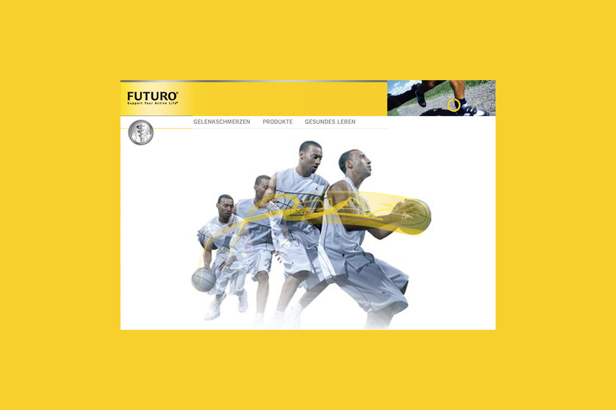
Futuro
If you have always been interested in taking a look under the skin, FUTURO was the right place for you. Almost every joint was shown in 3D, rotatable and all muscle layers and tendons could be switched on and off so that an anatomical detailed examination was possible. Project: Relaunch of the brand website Futuro, Beiersdorf Contribution: Concept, design, creative directionAgency: Fork Unstable Media, HamburgYear: 2006
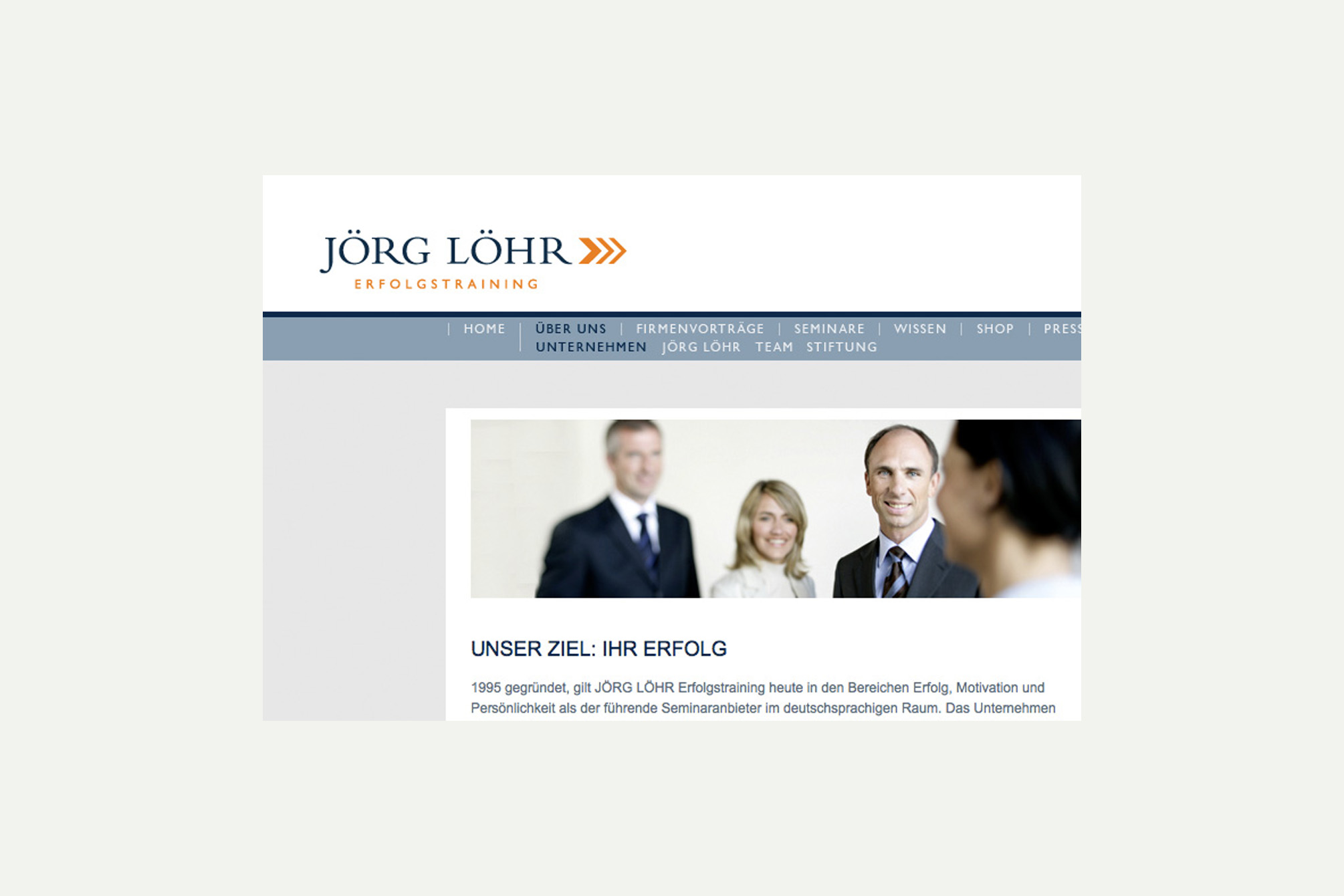
Jörg Löhr success training
Clarity and respectability were the focal points for the development of the new corporate design – logo, stationary and seminar materials. The website presents the personality and success trainer, his seminars can be booked online. The website comes with a broad chapter within which current findings on topics such as success, motivation and personal development can be found. All offers – seminars, products and articles – have been restructured and divided into four areas: personality, communication, business and health. Project: Branding and relaunch of the websiteContribution: Concept, design, art directionAgency: Scholz&Volkmer, WiesbadenYear: 2005
zehn
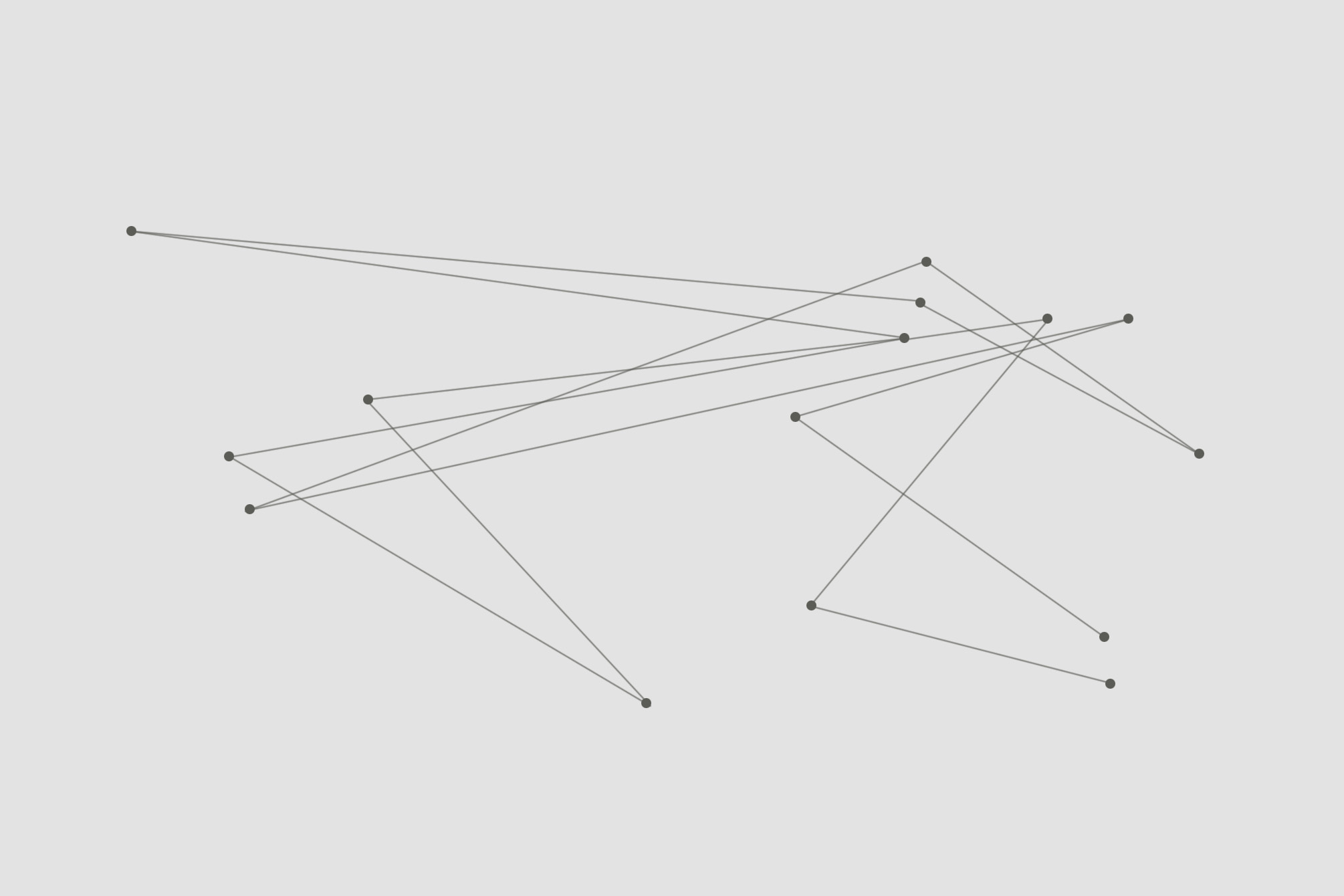
The guests of the anniversary party became part of a real-time installation: At check-in, each visitor received a transponder with personal data and was thus locatable. By user tracking, the movements were visualized on screens in real time during the party. As a memory, each guest received a link via e-mail to a website where guests’ whereabouts at the party could be found. AwardsThe project was included in the „Annual Multimedia“ yearbook 2006The project was included in the „D&AD Annual“ 2005Shortlist at the German Multimedia Award 2005, BerlinShortlist at the 52nd Cyber Lions, Cannes (2005) Project: Visualization of real-time data, anniversary party „zehn“Contribution: DesignAgency: Scholz&Volkmer, WiesbadenYear: 2004
trytype – experiments in typography
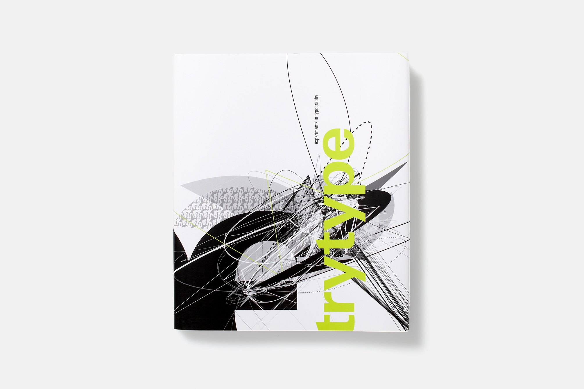
Imitation strongly encouraged! The results of the students’ “Experimental Typography” seminar were presented in a book – designed by the students themselves and published by Linotype Library, Bad Homburg. After a theoretical introduction to the historical development and significance of experimental typography, the theme of the seminar and the making of of the works were presented. Each piece is accompanied by playful instructions and documentation of the typeface used to inspire the community of readers to imitate, experiment with, and integrate experimental typography into their daily work. AwardsSilver medal at the Printers Club Award by M-Real, 2005, HamburgSilber medal at the CCD competition „Kommunikation vernetzt“ 2005, Frankfurt am Main Project: “trytype – experiments in typography”Mergenthaler Edition Linotype Library, Bad HomburgISBN 3-9810-319-1-1 Authors: Professor Guido Ludes, Steffi W. NeukirchenContribution: Concept, design, creative directionUniversity: RheinMain University of Applied Sciences, WiesbadenCooperation partner: Linotype Library, Bad Homburg, GermanyYear: 2005