Becoming visible is a process that goes far beyond the question of the right color or shape. Becoming visible is about focusing and committing, putting ideas into words, defining values, allowing yourself to have visions. This can be challenging, especially when the result is to be the basis for professional success. I accompany such processes with empathy and tact, support in gaining clarity and being proud of what is. Katrin Neiss, Neiss CoachingContribution: Positioning, (re)branding, design Kornelia Wulf, Souls OfficeContribution: Branding, design Anne Lücking Mewald, Art therapy & painting classesContribution: Positioning, photography, design Christiane Kiegeland, beziehungsweisenContribution: Positioning, branding explore.define.grow, personal development for womenContribution: Positioning, course design, design, photography Year: 2019 – 2020, Berlin
Teaching: Design that matters 2
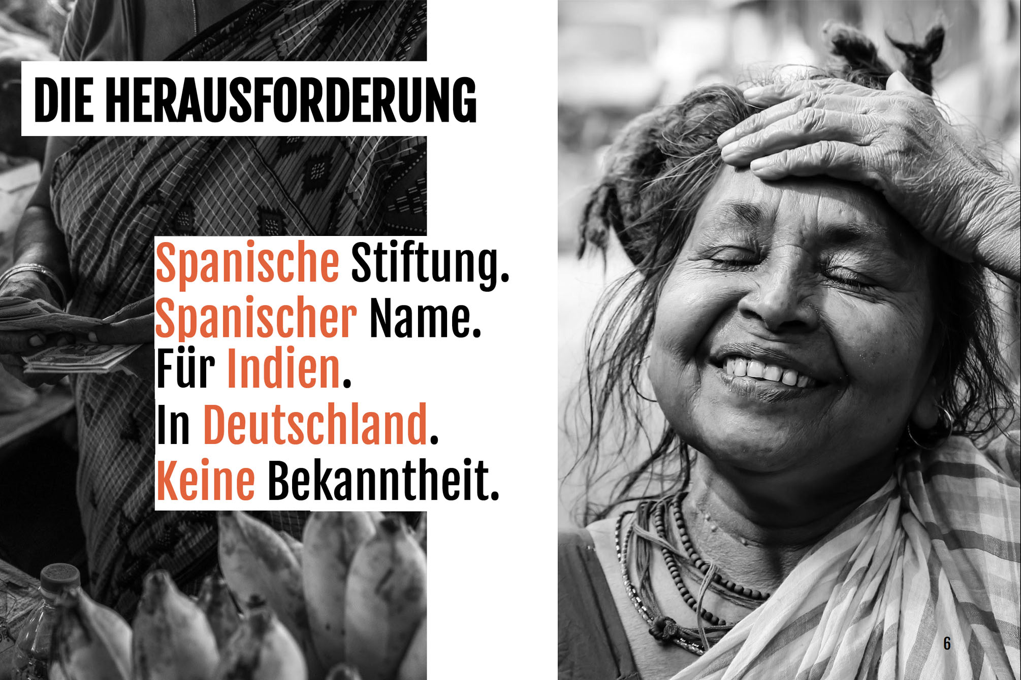
A Spanish foundation has been working successfully in rural regions of India for many years and is coming to Germany to generate donations here as well, in general and more specifically among a young target group. How can this work? In the summer semester of 2019, students from the master’s program in business communication supported Andrea Rudolph, executive director of the “Vicente Ferrer Foundation,” in this real world challenge. They developed strong, communication concepts and implemented them prototypically. Please find two excellent projects here. Share + Fair = Shair Excerpt from the concept: “We want to create Moments of Relevance by integrating the action of donating into the living environment of the target group. Young people should be picked up where they hang out, which is why we decided to get in touch with them on their smartphones, which they always have with them, and develop a donation app – which we call shair.” Students: Linda Rosendräger, Luisa Sabrowski, Maximilian Tassi Letters for Women Excerpt from the concept: “With #lettersforwomen, we give the target group the opportunity to quite simply and literally set a sign for female empowerment, equal rights, as well as independence. We are creating a platform where donors can buy letters and use them to generate donations using a gamification approach.” Every letter makes a difference, ..male Empowerment becomes FEmale Empowerment, ..dependence becomes INdependence and ..men Empowerment becomes WOmen Empowerment – every letter gives an Indian woman a voice! Students: Katja Galitschew, Plamena Maleva and Shirin Yazgan Course: Media conceptContribution: Course design, teachingProgram: Master of Business communicationUniversity: HTW, BerlinYear: 2019
Teaching: Design that Matters 1
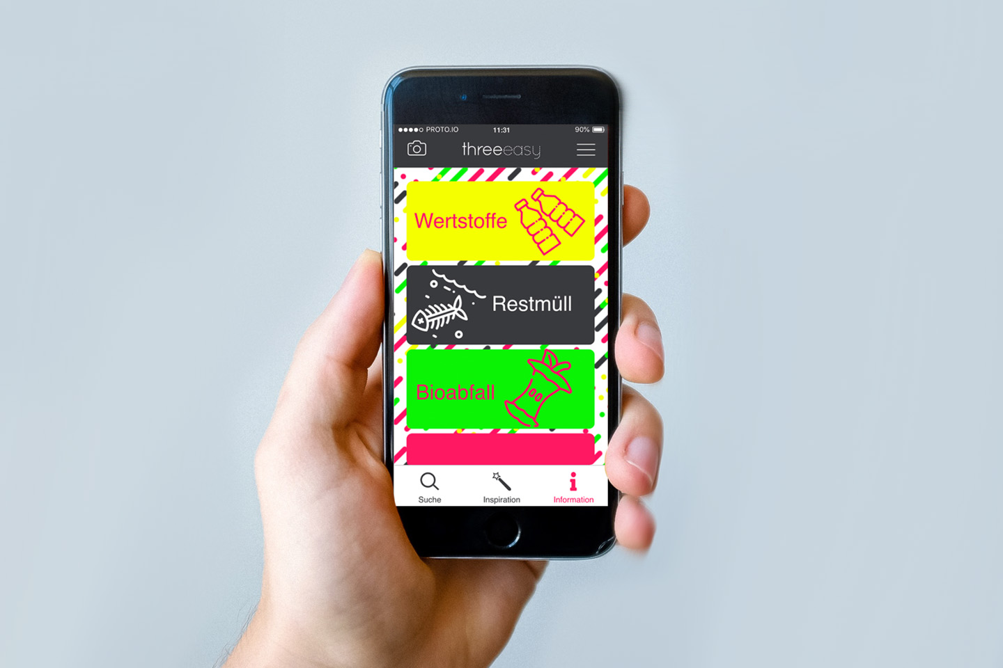
Design that Matters – that was the title of a course I held in the Masters Program of Business Communication at the University of Applied Sciences, Berlin. With Design Thinking techniques we focussed on finding innovative answers to questions raised by current social issues. Topics or questions the students wanted to address were for example: to reduce the amount of plastic rubbish or how to help people to recycle their plastic correctly, the “Kita Krise” in Berlin or how we can fight loneliness and anonymity in major German cities, not just for the elder. Even though the topics themselves were not new, the students were able to find new solutions through empathising, a strong focus on the persona’s needs and the use of different brainstorming techniques. threeeasy – recycling made easy… The initial question of the group of students was: … Through intense fieldwork and letting their interview partners document their trash situation with photos, they found out, that … threeeasy’s three brand values: encouraging, eco-friendly and easy The SOLUTION for small households: threeeasy – the three-piece garbage bag and an App that helps you sort your stuff(students from left to right: Lena Lülfing, Jonas Hilkert, Carolin Oberst) Visualising research data and findings was an essential part of the development process, as well as prototyping and creating mood boards. Student feedback:“The course was very dynamic and we were able to do a lot of creative work independently in our groups. I also found the lectures on design thinking and „good design“ very interesting and enlightening.” Course: Design concept, Design ThinkingContribution: course design, teachingProgram: Master of Business CommunicationUniversity: HTW, BerlinYear: 2019
Teaching: Interactive Media
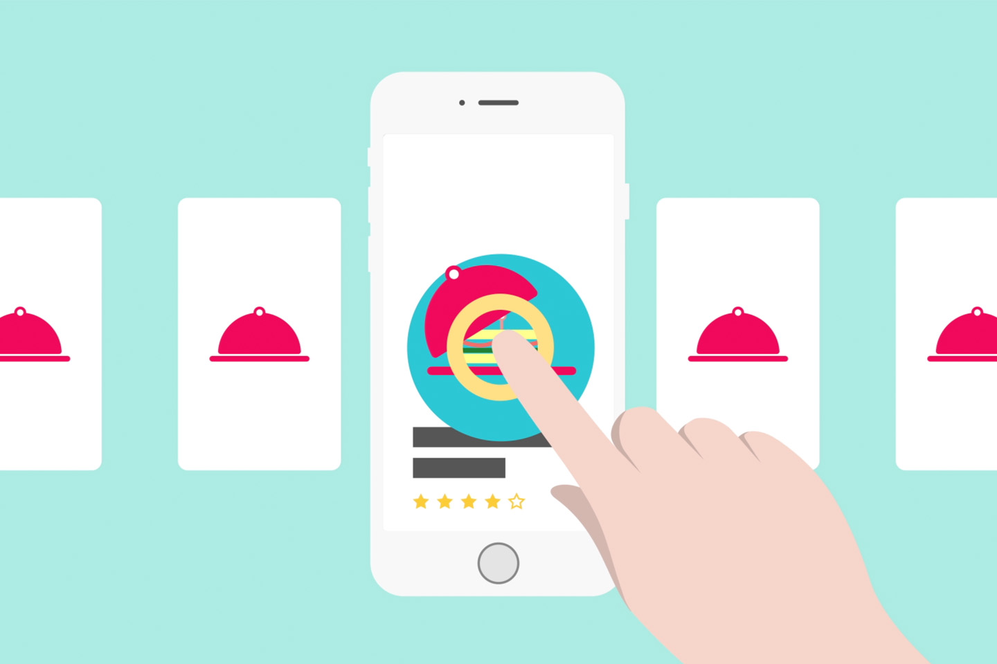
From basics in programming to information architecture, from creating a navigation concept to basics in user experience design, from responsive web design to mobile applications. At RMIT Vietnam, two sequential modules provided a broad overview of key topics in interactive media and user experience design. A mobile application called “chefipy” is helping to solve the problem of food waste (posters, mock up, wireframes and stills from a presentation movie for the cooking app) from Anh Dang Ngoc Huy, Kiet Pham Tuan, Huynh Nguyen, Toàn Minh and Tran Nguyen Ngoc Responsive City Guide about Saigon from Anh Dang Ngoc Huy , Kiet Pham Tuan, Huynh Nguyen, Toàn Minh and Tran Nguyen Ngoc Responsive City Guide about Kyoto from Hai Phan Thanh DADA inspired basic programming exercises from Hoan Tran Khai Anh Dang Ngoc Huy Nhi Tran Thuy Y Course: Interactive Media 1 & 2Contrubution: course design, teachingProgram: Bachelor of Design (Digital Media)University: School of Communication & Design, RMIT VietnamYear: 2016 – 2018
IGS, Hcmc
The International German School Ho Chi Minh City (IGS) is an inter-cultural place of learning and is open to children of all nationalities – this is the new positioning with which the IGS now presents itself on the market. Project: positioning, branding, website, eventsContribution: Concept, design, creative directionClient: International German School, Ho Chi Minh City, VietnamYear: 2015
Kunst.Schule.Rostock.
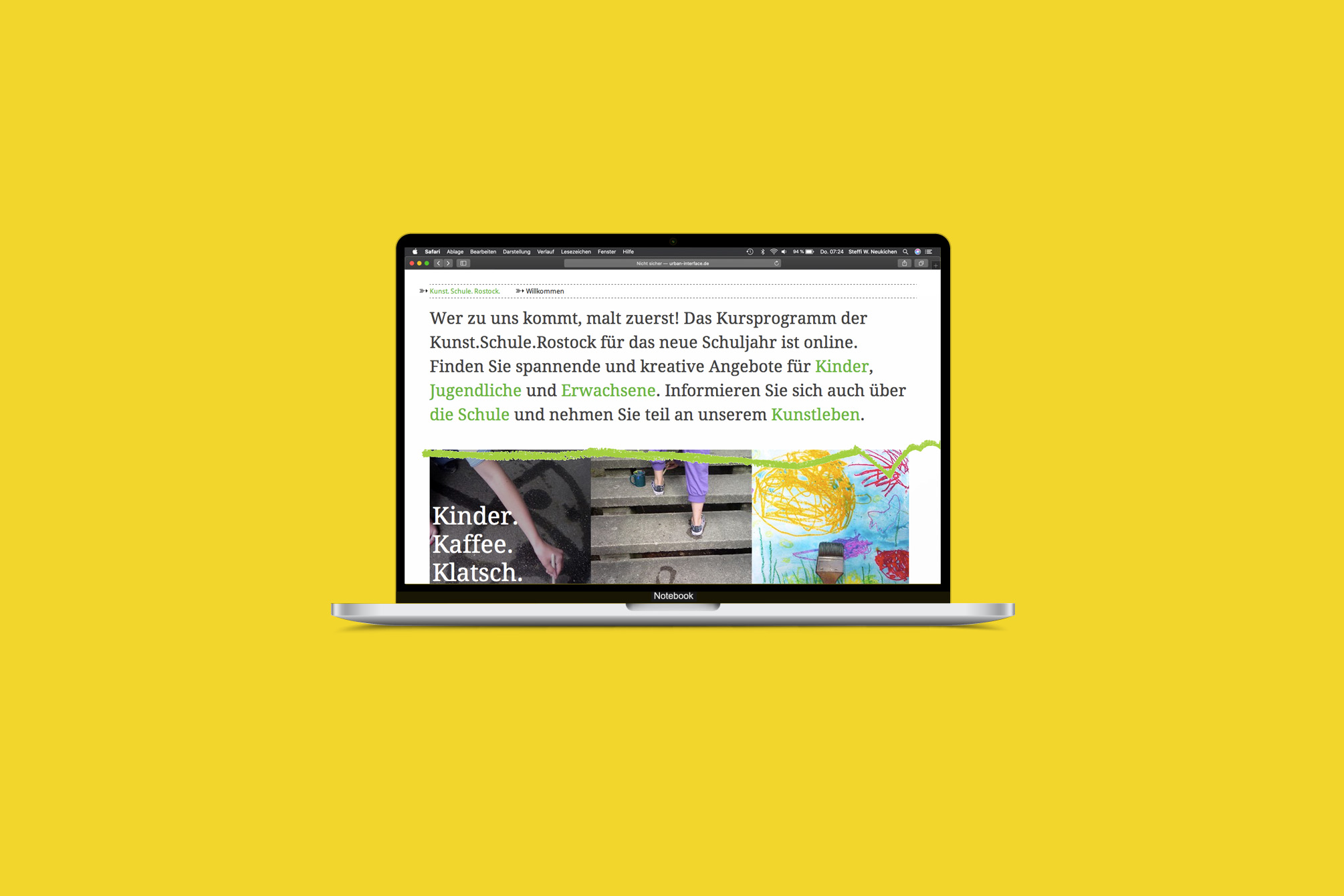
„Wer zu uns kommt, malt zuerst!“ – The Kunst.Schule.Rostock addresses people of all ages and has set itself the task of promoting creativity, imagination and artistic expression. I was able to accompany the school during its reorganization, during the move to interim quarters while the old school building “Frieda 23” was being renovated, and also during the second move back. With each step, the communication became clearer and the processes, e.g. for course booking with the help of an online registration tool, became easier and more professional. Project: Strategic consulting, new branding and websiteContent management system and registration toolVarious means of communicationThe website was developed in collaboration with Tim Kellner, Rostock. Contribution: Concept, design, creative directionClient: Kunst.Schule.Rostock, RostockYear: 2011 – 2013
RITTER SPORT Friends
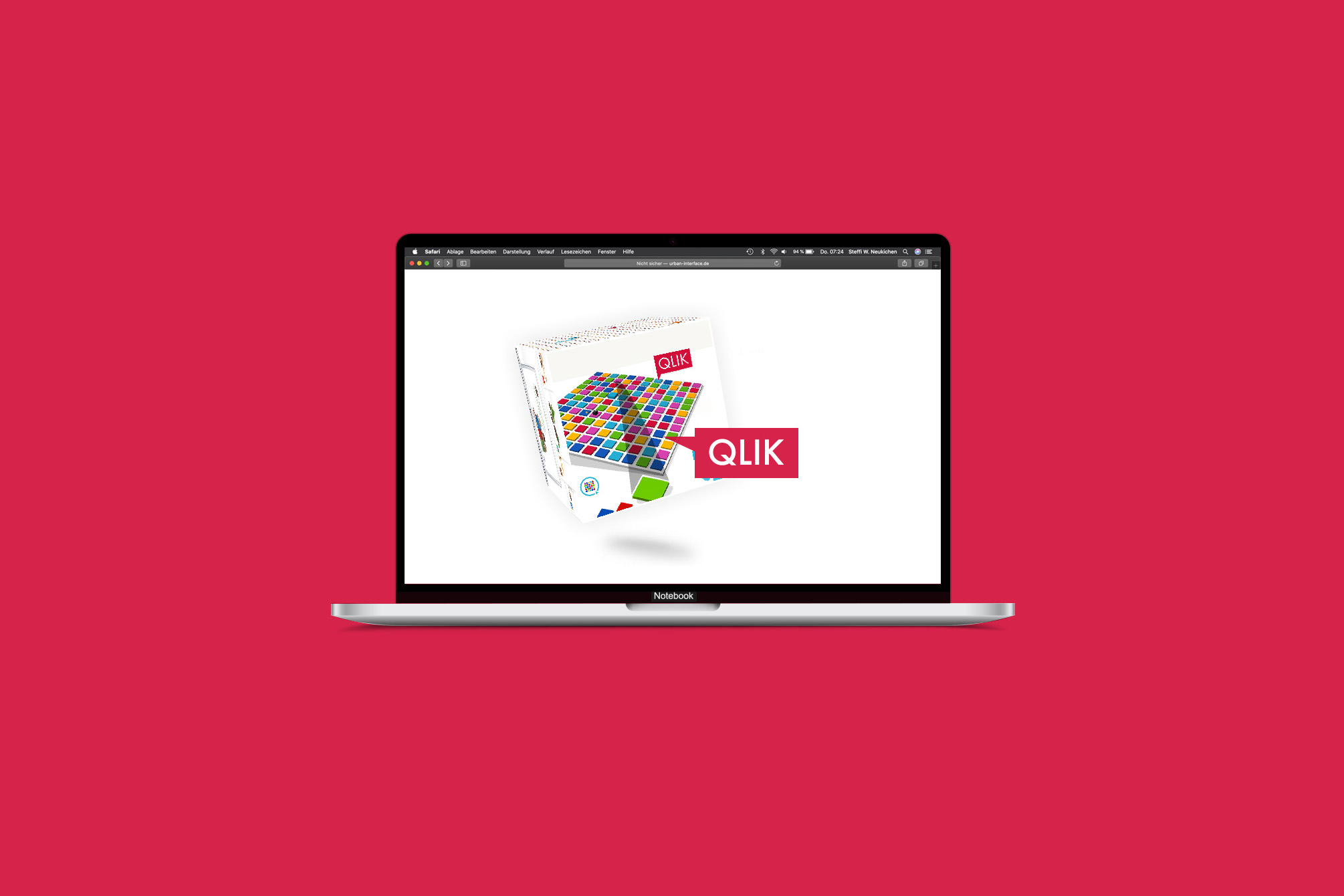
Strawberry Yogurt, Alpine Milk or Full Nut Friend? Everyone can decide. Everyone can be part of it. AwardBronze at Online Star-Award 2009, Ulm Project: Relaunch of the campaign website www.rittersportfreunde.deEntertainment platform containing a realtime multiplayer browser game QLIKRegistration with avatar tool, RITTER SPORT-friends galleryIntegration of the platform into the brand website Contribution: Concept, design, creative directionAgency: Fork Unstable Media, HamburgYear: 2009
RITTER SPORT Bio
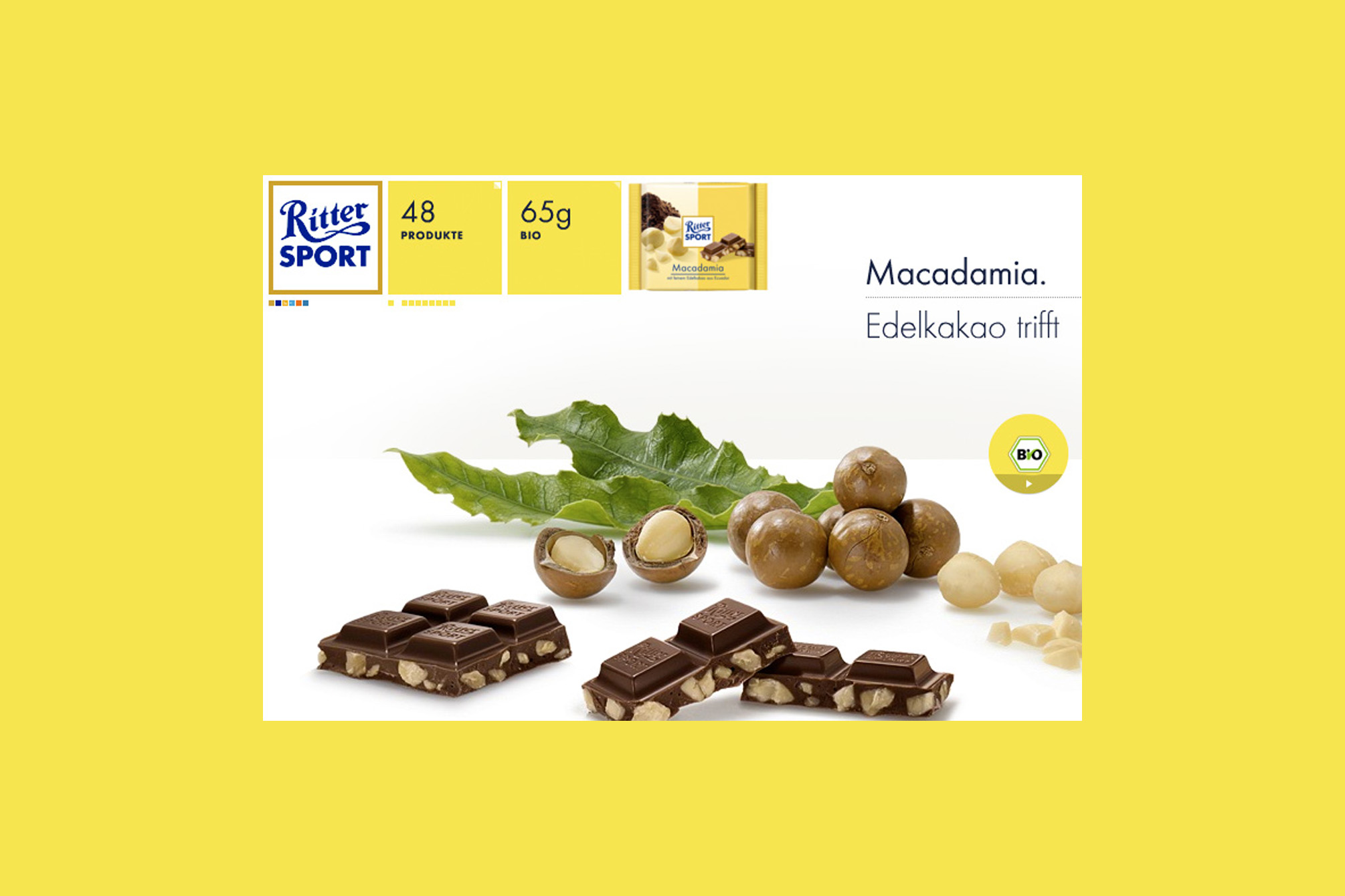
„Mir sind Schwabe, mir könne ned anderscht,“ – this is the Swabian way of saying „We can not help it“ and it was Alfred Ritter’s answer to the question why the RITTER SPORT Organic Chocolate is made with such great effort, perfection and attention to detail. There is nothing to add. Project: Web special for the introduction of the RITTER SPORT organic chocolate rangeContribution: Concept, design, creative directionAgency: Fork Unstable Media, HamburgYear: 2008
RITTER SPORT
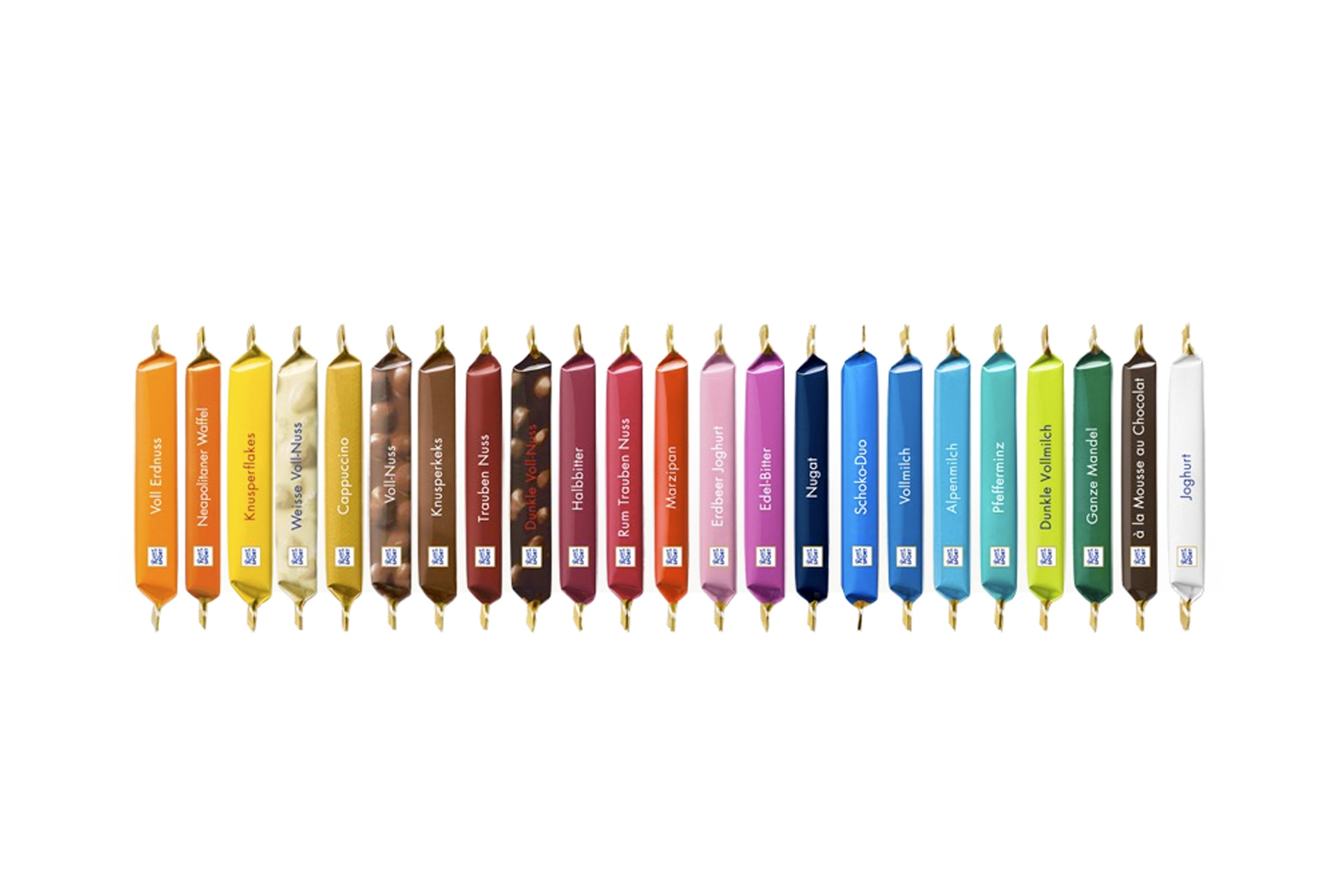
Why is the RITTER SPORT chocolate a square? Because it fits better in the pocket of a sports jacket without breaking and still has the same weight as a conventional bar. This was Clara Ritter’s pioneering idea in 1932, profitable also because the new factory in Waldenbuch was located on the way to the sports field. With the relaunch of the German brand website, a new online strategy was developed to build up a comprehensive offer of information and a cohesive brand experience in several steps. The „RITTER SPORT Spirit“ (to experience the brand and the products in a playful way), honesty (Swabian Authenticity) and quality were identified as the major brand values. The new website is an homage to the square shaped chocolate, the colours of the products can be found in the navigation and teasers. For the relaunch, we developed a new kind of product staging: large tasty chocolate pieces in combination with the corresponding „best“ ingredients. The pictures we shot for the website are now widely used. Based on the German brand website, three language versions (English, Italian, Russian) were developed. AwardsNominated for the Design Award of the Federal Republic of Germany 2009, Berlinred dot for high design quality, red dot communication design award 2008, EssenSilver medal at the DDC competition Kommunikation vernetzt 2008, Frankfurt am Main German brand website Internationalisation Project: Relaunch of the German brand websiteDevelopment of an online strategy and (online) corporate designProduct staging, ShootingContribution: Concept, design, creative directionYear: 2008 Agency: Fork Unstable Media, Hamburg
Aspirin
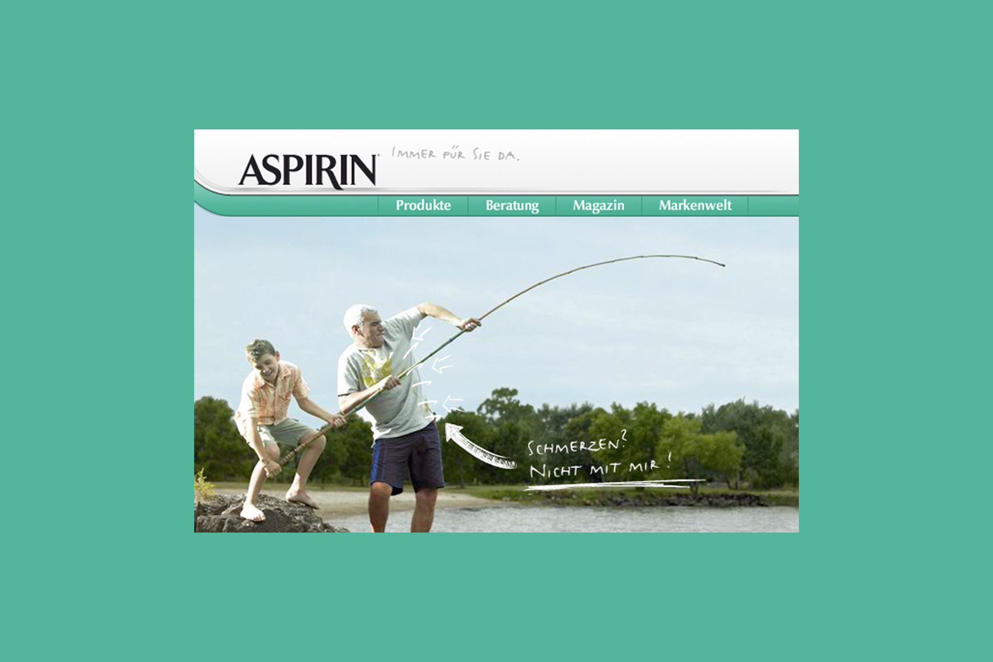
Pain? No way! There is a solution for every kind of pain, as well as for outdated design: after the Aspirin product packaging has been renewed, the website was adapted and modernised. Accompanying the packaging relaunch of the aspirin products, the German brand website was revised in its structure and adapted to the new look. A new image and illustration style has also been developed for the website. The result is user friendly and easy to navigate, each product section has its own style. Additionally, a pain counselling tool was created and the brand history mapped. Project: Relaunch of the German brand website of Aspirin (Bayer Health Care)Contribution: Concept, design, creative directionAgency: Fork Unstable Media, HamburgYear: 2008